
Crescendo - A High fidelity, audio equipment company.
About the logo:
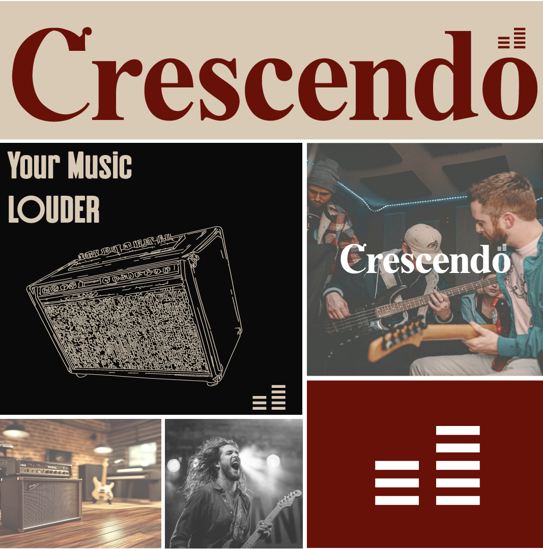
The deep maroon colour represents the richness of sound, while the subtle curves in the lettering suggest movement, flow, and the dynamic nature of music.
A minimalist icon of stacked bars, subtly reminiscent of a sound equaliser, is incorporated as a logo element. This symbolises both the technical precision and the progressive rise in sound quality that the brand represents, aligning with the literal meaning of "crescendo" in music.